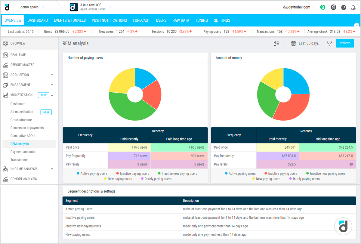









Most CRM systems offer basic segmentation: filter customers by country, industry, or purchase date range. These rule based segments are easy to create but miss the natural groupings that exist in customer behavior.
Two customers from the same city who bought the same product may behave completely differently. One logs in daily and buys frequently; the other rarely engages. A rule based filter cannot discover these behavioral patterns automatically.
Clustering solves this problem. It is an unsupervised machine learning technique that finds hidden groups within data without being told what to look for.
The algorithm examines customer attributes such as recency, frequency, monetary value, pages viewed, support tickets, and email opens. It groups customers who are similar to each other.
The result is a set of behavioral segments that emerge from the data itself, not from preconceived rules.
The Limitations of RFM and Rule Based Segments
RFM analysis, while powerful, only uses three dimensions. A customer who buys frequently but always on discount behaves differently from a frequent buyer who pays full price.
RFM treats them similarly if frequency and monetary are identical. Rule based segments like “high value” or “at risk” depend on arbitrary thresholds chosen by a marketer.
What counts as high frequency in one business may be low in another. Thresholds that made sense last year may be obsolete today.
Clustering evaluates many dimensions simultaneously. A single clustering model might include days since last purchase, number of purchases in last 90 days, average order value, support ticket count, email open rate, and product categories purchased.
The algorithm weighs all these features to form segments that would be impossible to define manually.
Two Powerful Clustering Methods for CRM
K Means Clustering is the most popular method for customer segmentation. It requires the user to specify the number of segments in advance.
The algorithm then assigns each customer to one cluster, minimizing the distance between customers within the same cluster. K means works well for large datasets, such as thousands or millions of customers.
For example, a K means model on an ecommerce dataset might discover a cluster of high spending, frequent buyers with low support tickets. You could call these Champions.
Another cluster might be moderate spend, infrequent buyers with high email engagement. These are Interested but not converting.
A third cluster could be low spend, one time purchases with high support tickets. These are Dissatisfied one timers.
Cohort Analysis is different but complementary. A cohort is a group of customers who share a common characteristic within a specific time period.
The most common cohort is acquisition month: all customers who made their first purchase in January 2025. Cohort analysis tracks how these groups behave over time, such as their retention rates or average spend per month.
Unlike clustering which creates static groups, cohort analysis reveals longitudinal patterns. Does the January cohort retain better than the February cohort?
Do customers acquired from paid search spend more over six months than those from organic social?
Why Use Both Together
Clustering and cohort analysis answer different questions. Clustering tells you what types of customers you have right now. Cohort analysis tells you how different vintages of customers behave over time.
A mature CRM strategy uses both. First, cluster customers based on behavioral attributes to understand current segments. Then, break each cluster down by acquisition cohort.
A champion cluster that consists mostly of customers acquired two years ago may indicate that newer acquisition channels are failing to produce champions. This insight would be invisible using only one method.
K Means Clustering Step by Step
K means clustering is powerful but requires careful setup. The algorithm is sensitive to data scaling, outliers, and the choice of how many clusters to create.
Start by selecting features that differentiate customer behavior. Good candidates include recency (days since last purchase), frequency (purchases per time period), monetary (total spend), average order value, days between purchases, number of product categories purchased, support ticket count, email click through rate, and login frequency.
Avoid features that are constant for all customers or are identifiers like customer name or ID.
K means uses distance calculations, which are heavily influenced by feature scales. A monetary value in dollars ranging from zero to ten thousand will dominate days since last purchase ranging from zero to three hundred sixty five if not normalized.
Standardization transforms each feature to have a mean of zero and a standard deviation of one. This ensures each feature contributes equally to the distance calculation.
Missing values must be handled. For numeric features, impute with median or mean. For categorical features like payment method, convert to binary dummy variables.
Choosing the Number of Clusters
The user must specify how many clusters before running K means, but the optimal number is rarely obvious. Several heuristics help.
The elbow method runs K means for a range of values, such as two to fifteen, and calculates the within cluster sum of squares, which is the total distance of each point to its cluster center.
As the number of clusters increases, this value decreases. Plot the number of clusters against this value. The elbow is the point where the rate of decrease sharply slows. That number is a good choice.
The silhouette score measures how similar a point is to its own cluster compared to other clusters. Scores range from negative one (poor) to positive one (excellent).
Calculate average silhouette for each number of clusters. The number with the highest score is optimal. For most CRM applications, between three and eight clusters works well.
Fewer than three clusters oversimplify customer diversity. More than eight clusters become difficult to name and take action on.
Interpreting Cluster Profiles
After choosing the number of clusters, run the algorithm. The output includes cluster labels for each customer and cluster centers, which are the average value of each feature for customers in that cluster.
Interpretation examines these centers. For example, with four clusters you might see:
Cluster one has very recent activity, high frequency, and high spend. This group is Champions. Best retention priority.
Cluster two has moderately recent activity but slipping frequency and medium value. This group is At Risk. Re engagement needed.
Cluster three has very recent activity but only one purchase and low spend. This group is New One Timers. Onboarding focus required.
Cluster four has long time since purchase but historically high frequency and spend. This group is Lapsed High Value. Win back candidates.
Validating Clusters
Before acting, validate that clusters are stable and meaningful. Check that each cluster has a reasonable number of customers, not a single outlier cluster with only two customers.
Verify that cluster profiles make business sense. A cluster with high recency and low monetary but high frequency might be a “frequent small basket” segment, plausible for convenience stores but not for luxury goods.
If a cluster profile contradicts domain knowledge, revisit feature selection or try a different number of clusters.
Common Pitfalls in K Means for CRM
Including too many features adds noise. Start with five to ten well chosen behavioral variables. Ignoring seasonality is another mistake.
Run clustering on a time period that normalizes seasonal effects, such as the last ninety days rather than the last thirty days for a business with monthly cycles.
Using raw data without normalization means monetary will dominate, producing clusters that separate only by spend. Also remember that clusters drift over time. Re run clustering quarterly because customer behavior changes.
Cohort Analysis in Depth
While K means clustering segments customers based on their behavioral attributes at a single point in time, cohort analysis reveals how groups of customers behave over time.
A cohort is a set of customers who share a common experience within a defined time window. The most common cohort definition is acquisition month: all customers who made their first purchase in January 2025.
Cohort analysis then tracks this group’s behavior, such as retention, revenue, and engagement, in each subsequent month.
Why Cohort Analysis Matters
Standard retention metrics like overall retention rate can be misleading. A company might report sixty percent retention, but that average hides two realities.
Customers acquired in January retained at eighty percent, while customers acquired in June retained at forty percent due to a product change or marketing campaign change. Cohort analysis exposes these differences.
It answers questions such as: Are newer cohorts retaining better than older ones? How does revenue per customer evolve over the first six months?
Without cohort analysis, a manager might incorrectly assume that a drop in total revenue is due to seasonality when actually recent acquisition cohorts are underperforming.
Defining Cohorts
The most common cohort type is time based cohorts: customers grouped by the period of their first transaction. Periods can be weeks, months, or quarters depending on the business cycle.
For fast moving ecommerce, weekly cohorts provide granular insight. For B2B software as a service, monthly cohorts are standard. For annual subscriptions, quarterly or semi annual cohorts work better.
Event based cohorts group customers by a shared action other than time. Examples include customers who signed up during a specific promotion, customers who attended a webinar, customers who experienced a website outage, or customers who were referred by an existing customer.
Event based cohorts help measure the long term impact of specific marketing or product initiatives.
Building the Retention Cohort Table
The classic cohort analysis output is a retention table. Rows represent cohorts, such as months of first purchase. Columns represent time periods since acquisition, like month zero, month one, month two, and so on.
Each cell contains the percentage of customers from that cohort who are still active in that period.
For example, the January 2025 cohort had one thousand customers. After one month, six hundred were active, which is sixty percent. After two months, four hundred fifty were active, which is forty five percent. The table reveals the retention curve for January.
The February cohort had twelve hundred customers. After one month, eight hundred forty were active, which is seventy percent. February cohorts retain better than January, suggesting improvement.
Cohort Heatmaps
A retention table becomes a heatmap when values are color coded. Green cells represent high retention, yellow moderate, and red low.
Heatmaps make patterns instantly visible. A diagonal pattern of green fading to red as columns increase is normal, because retention always declines.
But a cohort where the first column is green and the second column is bright red indicates a sharp drop after the first month, suggesting poor onboarding or product market fit.
Other Cohort Metrics Beyond Retention
Retention is the most common cohort metric, but other metrics provide deeper insight.
Revenue per active customer tracks whether retained customers become more or less valuable over time. A cohort where revenue per active customer increases in month three indicates successful cross selling or upselling.
Average order value over time shows whether customers increase basket size as they mature. A rising average order value curve is healthy. A flat or falling curve suggests limited product expansion.
Cumulative revenue per cohort answers: after twelve months, how much total revenue has this cohort generated? This directly informs customer acquisition cost decisions.
Integrating Clusters with Cohort Analysis
Clusters tell you what types of customers exist today. Cohorts tell you how different vintages of customers behave over time.
Integrating them reveals whether your customer segments are stable, improving, or deteriorating across acquisition cohorts.
First, assign every customer to a K means cluster based on their behavioral features over a fixed observation window, such as the first ninety days after acquisition.
Second, group customers into acquisition cohorts, like month of first purchase. Third, for each cohort, calculate the distribution of cluster assignments and track how that distribution changes over time.
If the June cohort shows a higher percentage of Champions and a lower percentage of One Timers compared to the January cohort, changes made between those months positively impacted customer quality.
Segment Drift and Transition Analysis
Customers do not stay in the same cluster forever. A Champion today may become At Risk in three months. Tracking segment migration is called transition analysis or segment drift.
Build a transition matrix that shows, for a given cohort, what percentage of customers moved from each cluster in month one to each cluster in month three.
If most Champions remain Champions, that is healthy. If a large percentage of At Risk customers become One Timers, that indicates a danger zone requiring intervention.
Compare transition matrices across acquisition cohorts. The June cohort might show higher Champion retention than the January cohort, validating new retention initiatives.
Building a Unified Segmentation Dashboard
An advanced CRM segmentation dashboard should answer three questions in real time. What are the current cluster distributions overall and by recent cohorts?
How are clusters trending over time? Which interventions should be applied to which segments?
A donut chart or stacked bar shows the percentage of active customers in each cluster. A grouped bar chart shows cluster percentages for each monthly cohort.
A Sankey diagram shows flow from cluster in one month to cluster in another month. Thick lines between the same cluster indicate stability. Thick lines from Champion to At Risk indicate a problem.
For each cluster and each transition, provide a one click export to marketing automation. Champions should receive loyalty offers. At Risk customers should receive re engagement campaigns.
Without actionability, the dashboard is just reporting. Clusters are not static. Re run K means monthly or quarterly to ensure cluster definitions reflect current customer behavior.
Advanced segmentation using K means clustering and cohort analysis transforms CRM from simple filtering into intelligent, behavior driven customer understanding.
Clustering discovers natural groupings across multiple behavioral dimensions, revealing segments that rule based filters miss. Cohort analysis tracks how different customer vintages behave over time, exposing the impact of product, marketing, and operational changes.
When integrated, these methods answer not only what types of customers you have but also whether newer cohorts are better and how customers move between segments over time.
A unified dashboard with current cluster sizes, cohort distributions, transition flows, and retention curves by segment provides a complete picture of customer health.
Organizations that implement both techniques gain the ability to personalize interventions, optimize acquisition channels, and ultimately increase customer lifetime value.